Skyn
Minimal skincare branding inspired by simplicity, softness, and everyday self-care.
Brand and Logo Design

Project Overview
Brand:
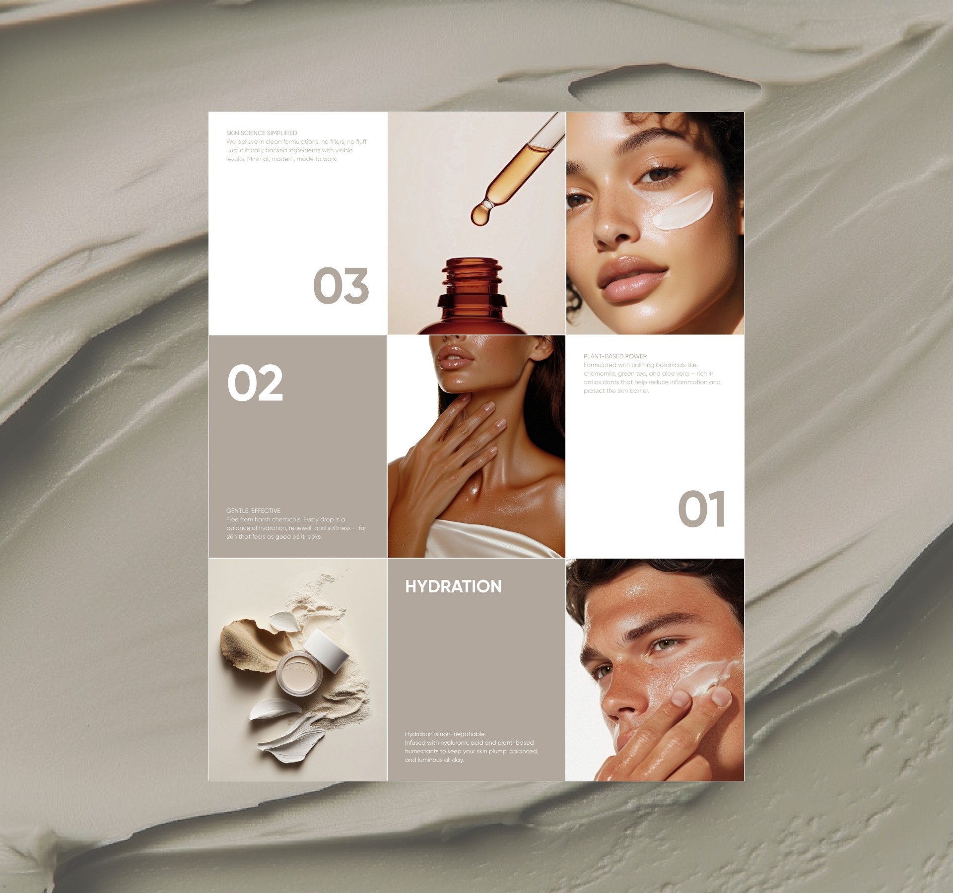
skyn is a skincare brand built on one idea- that effective, beautiful skincare shouldn't be a privilege. Designed for women aged 18–35 who are ingredient-conscious and aesthetically driven, skyn sits at the intersection of affordability and luxury.
The Challenge:
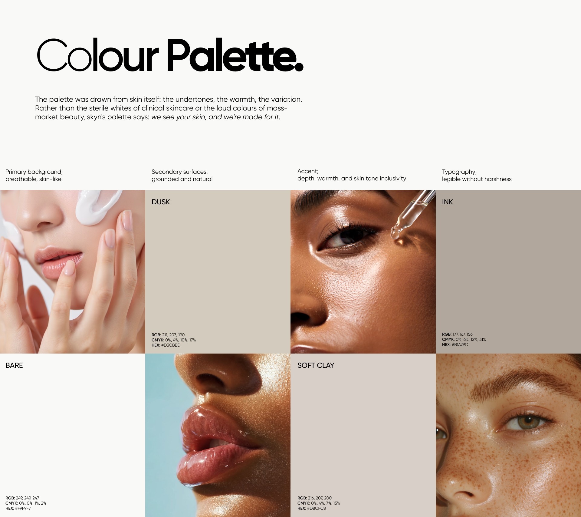
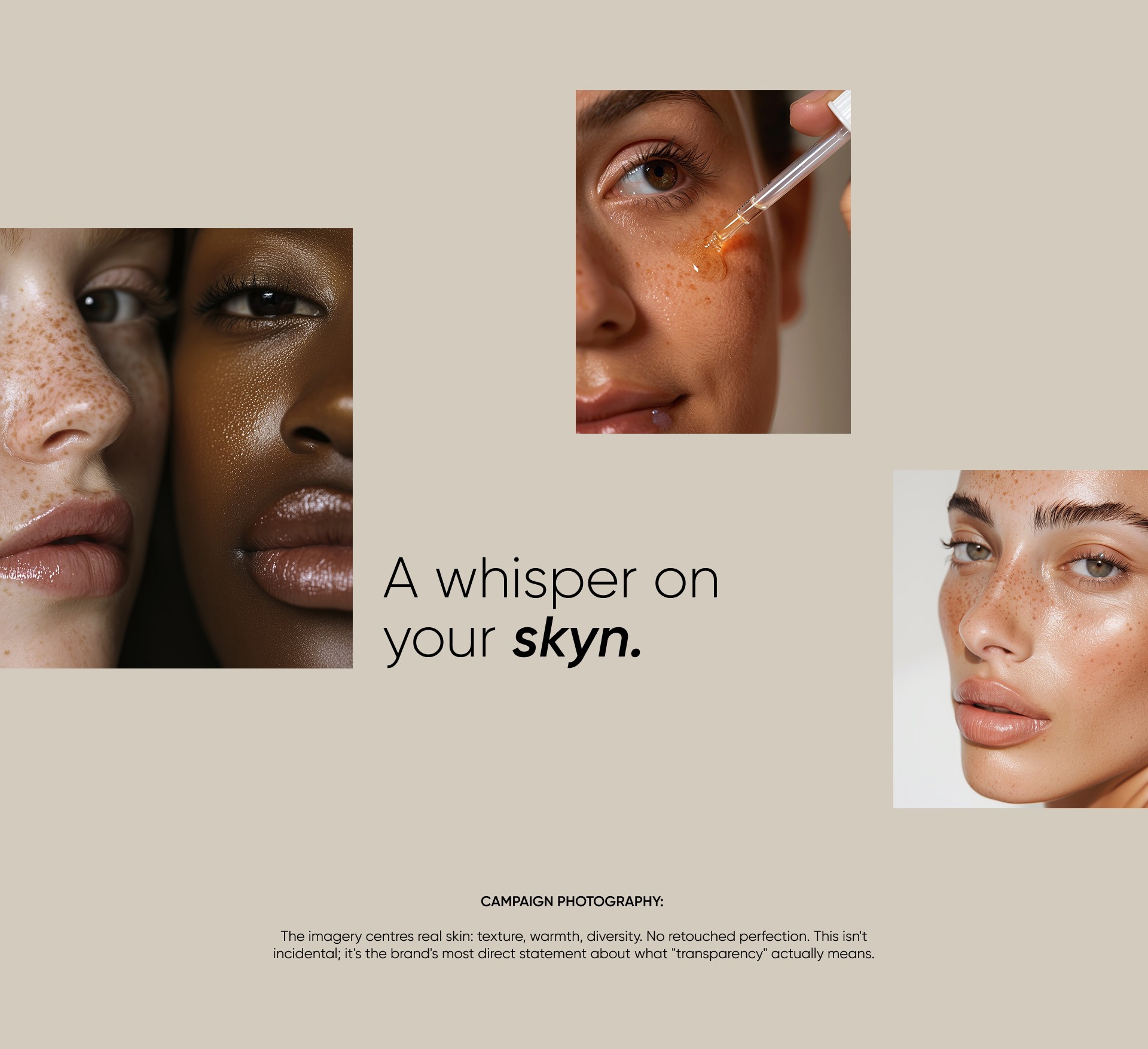
Create a brand identity that feels premium without feeling exclusive. Warm without feeling mass-market. The name itself is intentional: "skyn" signals transparency, a brand with nothing to hide and everything to show.
Role:
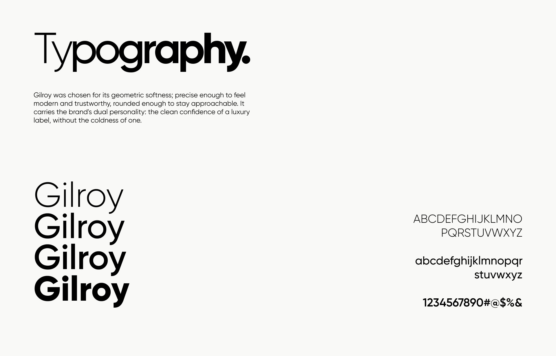
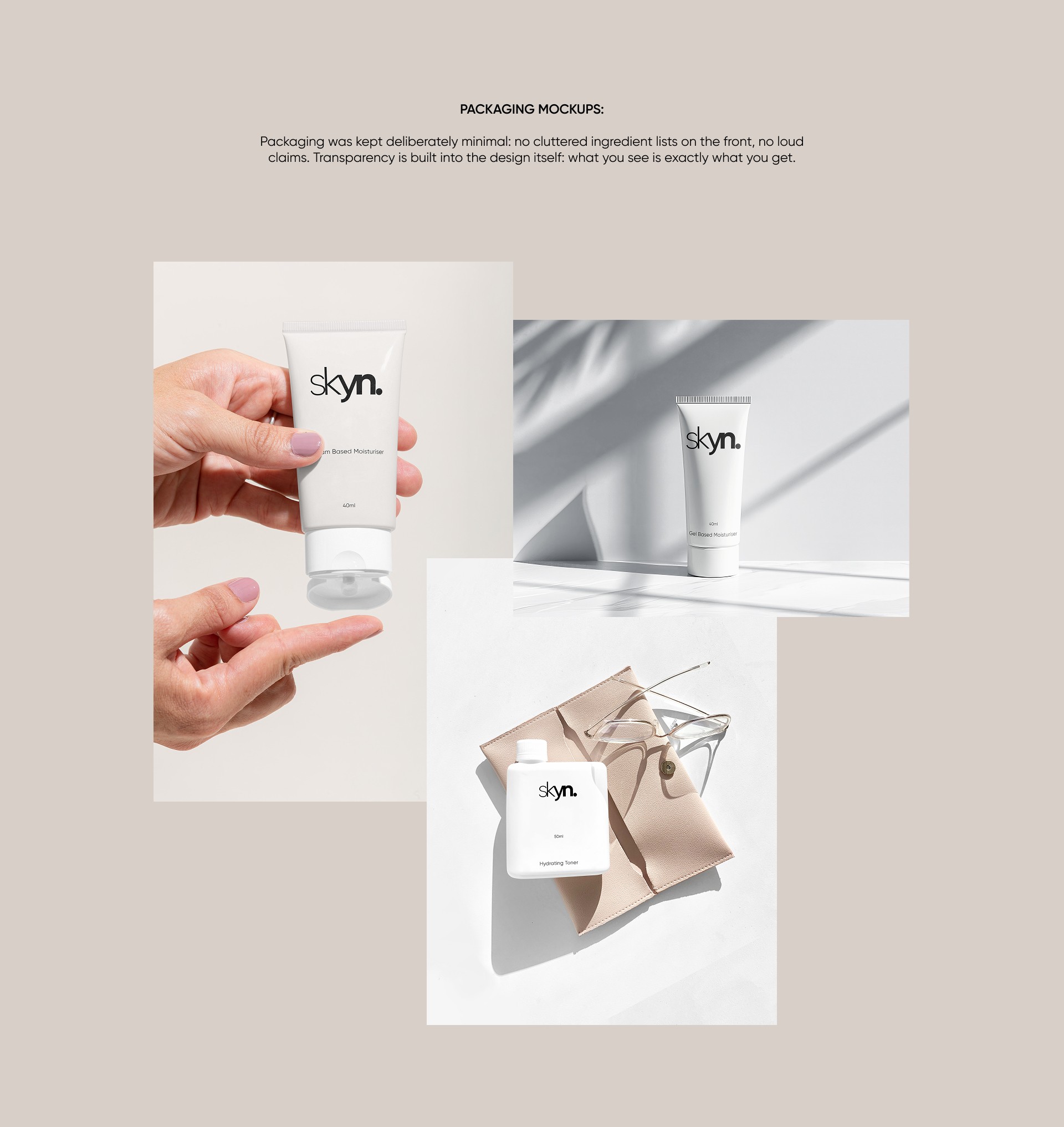
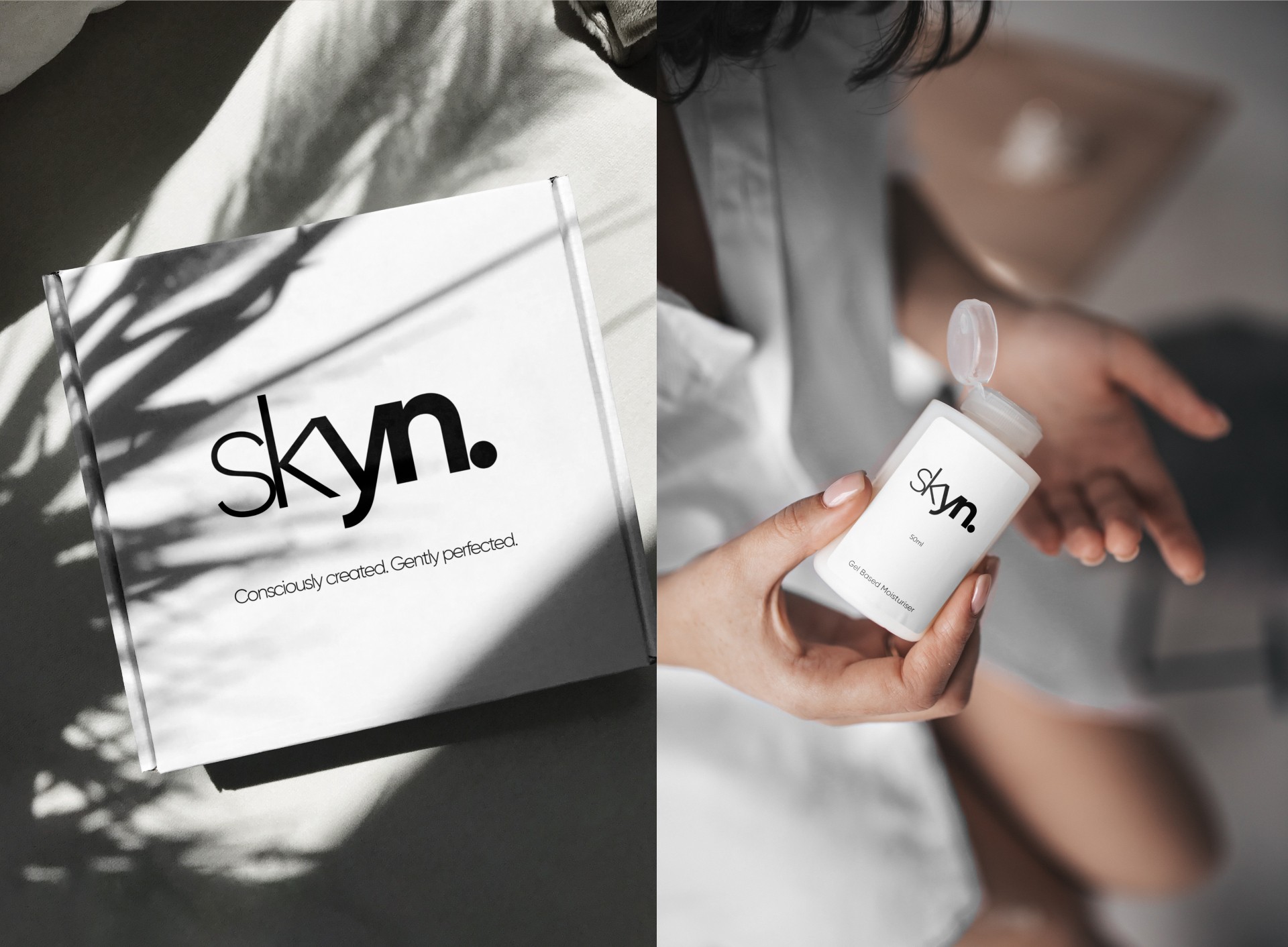
Brand identity design- logo, typography, colour system, packaging, and campaign visual language. Tools: Adobe Illustrator, Photoshop, Figma.
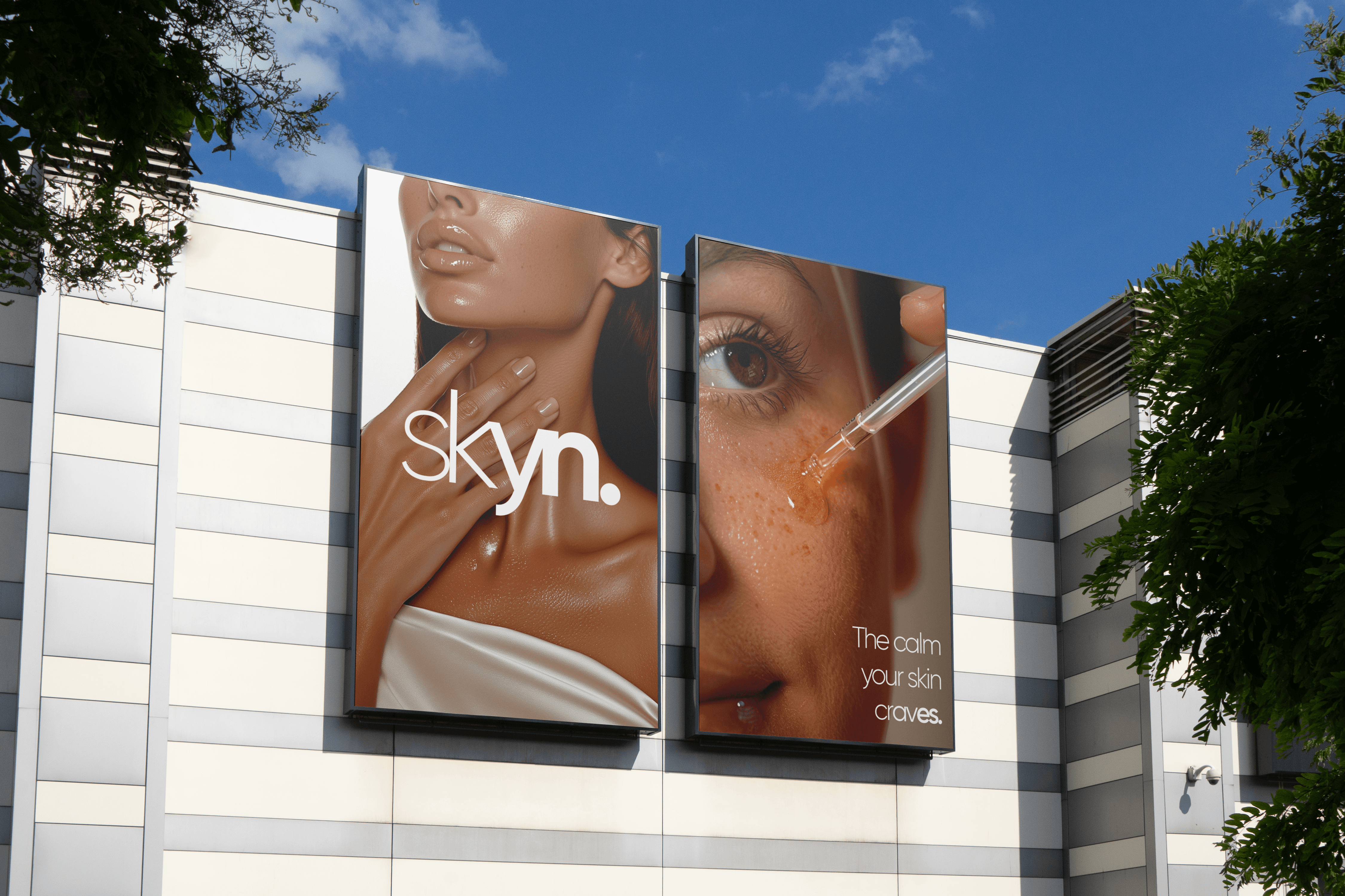
Outdoor Billboard Mockups:
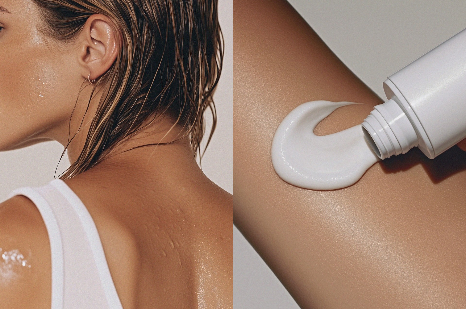
Outdoor advertising was art-directed to feel editorial rather than promotional — borrowing visual language from fashion campaigns. The goal was for skyn to occupy the same visual space as a luxury brand, even at a price point that doesn't.

skyn started as an exercise in restraint: how little could I use to say something meaningful? What I learned is that "affordable luxury" isn't a compromise, it's a design challenge. Every decision had to earn its place: the typeface, the palette, the negative space. If I were to push this further, I'd develop a secondary typeface for body copy to add more typographic range, and explore a wider set of packaging formats to test how the identity scales across product lines.